Pepsi's new retro logo and the evolution of an icon as seen on the American roadside
Exploring the open-air museum -- America -- that charts Pepsi's design evolution on its 125th anniversary.
One of the reasons Coke is “The Real Thing” is that it doesn’t mess with its identity too much. Well, there was that fiasco of New Coke in 1985, but it’s worthy of note that Coke used that imbroglio to double down on its iconography with its Coca-Cola Classic rebrand of the original formula.
Right about now, you might be asking, “Isn’t this post about Pepsi?” It is indeed, but you can’t do a post about Pepsi without tackling its relationship with Coke, and their forever rivalry, once a heated weapon dance at the height of the 1980s Cola Wars.
Pepsi is the perpetual Avis Car Rental of the Cola Wars (We try harder!) and so it often finds itself poking the bear that’s headquartered in Atlanta, Georgia. You know, the Pepsi Challenge. With New Coke in 1985, Pepsi, around then “The Choice of a New Generation,” had Coke on the run for a hot minute. Pepsi had some serious marketing momentum in those years, and that was the era when the Pepsi logo I miss so much was at its zenith.
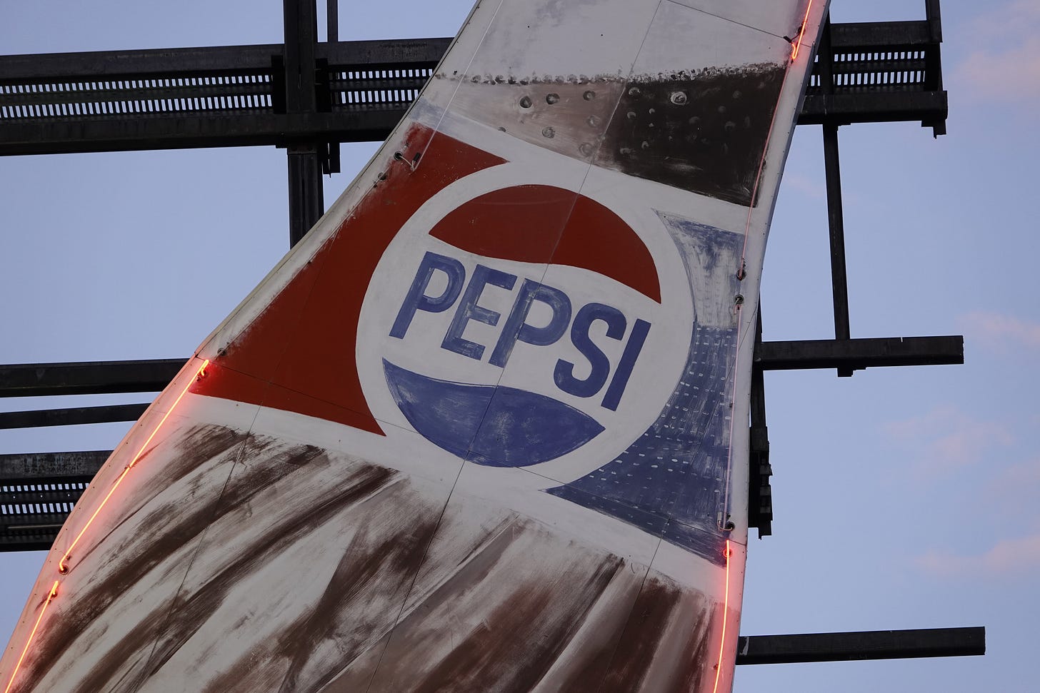
The official story goes that the logo was rolled out about 1973, according to most accounts, though it is derivative of an earlier one — an intermediary logo — that no longer featured the bottlecap background. (I’ll get into this more below.)

But much to my shock, the 1973 logo is actually the 1969 logo! In my research for this post, I discovered that the logo was being used in advertising, but not as the dominant logo, as early as October 1969, four years before it is said to have emerged as the overarching symbol of Pepsi. This really surprised me. It’s almost as if Pepsi was testing out this logo. When you see it, used in a subsidiary fashion, it jumps out at you. You wonder why it’s not front and center because it certainly deserves to be.
1969 was an interesting year, the coda of a decade when corporations were modernizing their identities, reducing them to their essence — clean symbols that would be widely and quickly recognized. The most famous example of this — and undoubtedly the most successful — was Saul Bass’ 1969 redesign of the Bell System logo. Just five years earlier, the company had introduced a simplified Bell, but still, very clearly a Bell, a first step in the dismantling of the fussy 1939 logo.
The 1969 logo reduced the Bell to a sleek, easy-to-grasp symbol, a modernist emblem that needed no explanation and no words. You saw it all by itself, and you grasped what it was. To this day, I am so sad that all the former Bell companies have abandoned the logo, with Verizon maintaining a vestigial use for legal reasons, at this point in phone books nobody uses.
I mention Bass’ logo because the Pepsi Globe logo distilled decades of iconography into a clean sphere, a potent symbol that could stand alone. You could easily lose the word Pepsi and know what the symbol stood for.
Pepsi updated the logo slightly in 1987, changing the typeface to give it a more futuristic look, and then, in the fall of 1991, the design meddling began when they rolled out a replacement for the simple Pepsi Globe, the word Pepsi separated from the sphere. The Globe and the word PEPSI would be in each other’s orbit, but not together again, for the next 32 years. The design tinkering continued twice a decade or so, and by 2008, Pepsi changed the color scheme to a pale blue, introduced a slender typeface, and put the Pepsi globe on its side, which came to be known as “the smile.”
I frowned.
But Pepsi always knew it had something in that 1970s logo and periodically would revive it on its Pepsi Throwback cans and bottles, seen below on shelves in 2018.
There was excitement and energy around that discarded logo, and when Pepsi recently began to toy with its image again, that 1970s version was clearly a wellspring of inspiration.
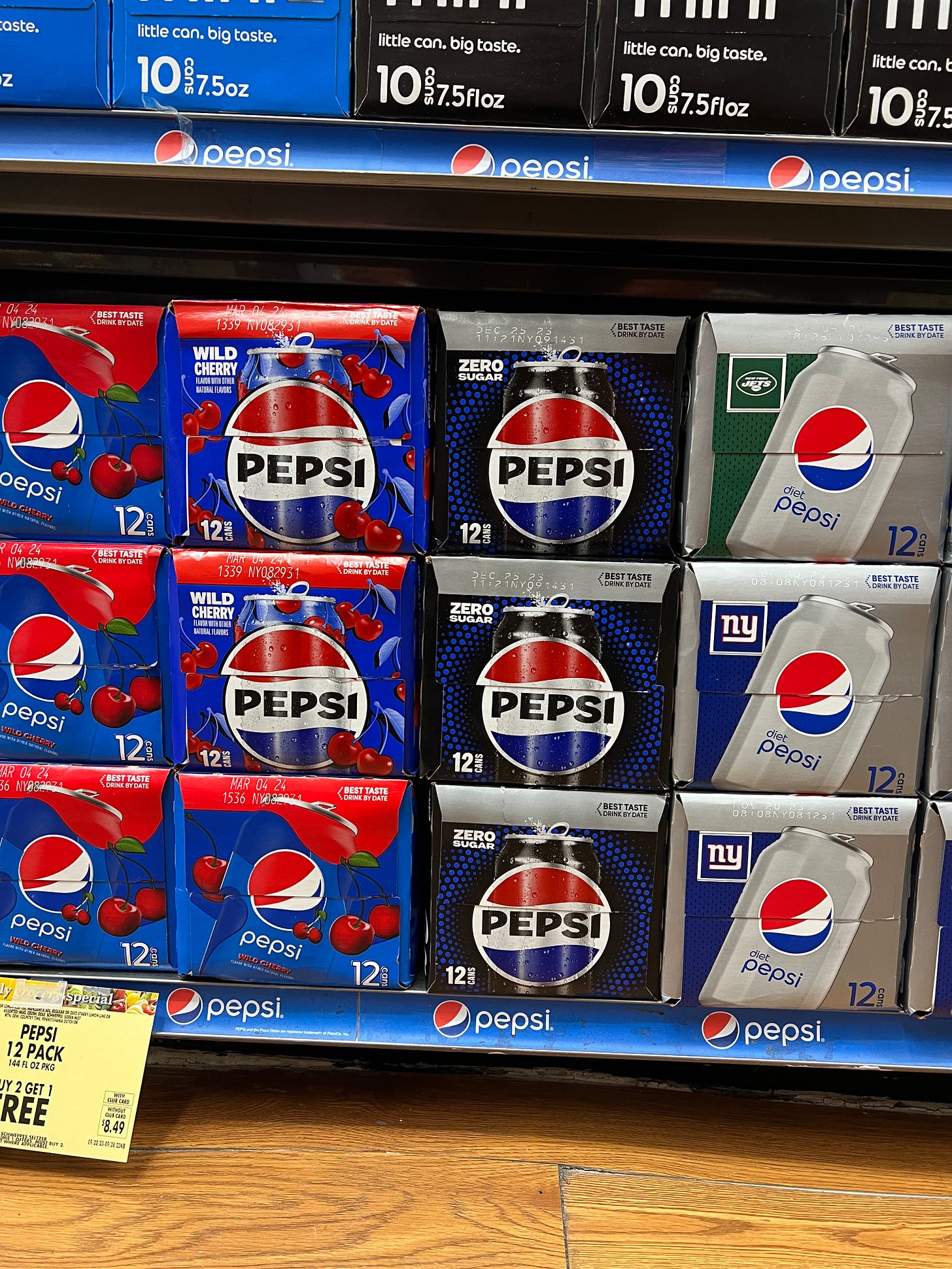
And so the recently introduced redesign returns Pepsi to that simple circle, reuniting the word PEPSI with the Globe. There are notable differences, of course, including color and typeface, but it’s clear that we are seeing Pepsi assert its heritage again, finding what’s iconic and enduring about its imagery. I love seeing the word PEPSI back in the white space of the red, white, and blue sphere and using a bold typeface.
So why not just bring back the 1970s logo? I suppose they could have done that, much like Pizza Hut did with the return of its 1974 logo in 2019.
But Pepsi took a “Burger King approach” here, revealing a “retro” logo that is a clear descendant of the beloved 1970s original. This is the kind of Pepsi logo we may have arrived at anyway had the design decisions made between 1991 and 2008 never happened. It’s a fresh take on a classic, forward-looking while respectful of the past.
The smile is now on my face, not on the logo.
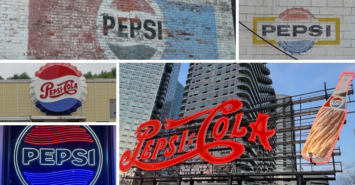
The American roadside offers a free museum where you can chart the evolution of the Pepsi symbol, and here are some fine examples you can find from coast to coast.
NOTE: This is not meant to be a definitive history of the logo. Rather, it reflects those logos that can be found in the wild. You won’t, for instance, see Brad’s Drink, the first name of this cola, born in New Bern, North Carolina, at Caleb Bradham’s drug store. But it’s a pretty comprehensive look at what’s out there from 1940 to today. (Interesting fact: You can see the earliest iteration of the Pepsi-Cola logo on Bradham’s grave.)
****
The script wordmark logo
Pepsi-Cola neon sign, Long Island City
Versions of this logo date back to the late 1890s. The above reflects how the logo looked in 1940.
This massive sign in the Queens neighborhood of Long Island City is a holdover of the now-posh neighborhood’s industrial past. The original version of the sign was installed in 1940 — not 1936, as cited in multiple reports — reflecting the era when the script logo featured a hyphen rather than a dash between the words PEPSI and COLA and an extended fancy flourish on the top of the letter C. An earlier version had the word DRINK in that flourish.
Artkraft Strauss reconstructed the sign itself in the 1990s. (A version of the 1970s bottle had replaced an earlier one.) Pepsi’s plant closed here in 2003, but the sign would find a new home at Gantry Plaza State Park nearby.
It was designated a New York City landmark in 2016. See the designation report, as well as a photo of the sign from 1988, when it still stood atop the Pepsi factory. Interestingly, Pepsi still maintains the sign. [MAP]
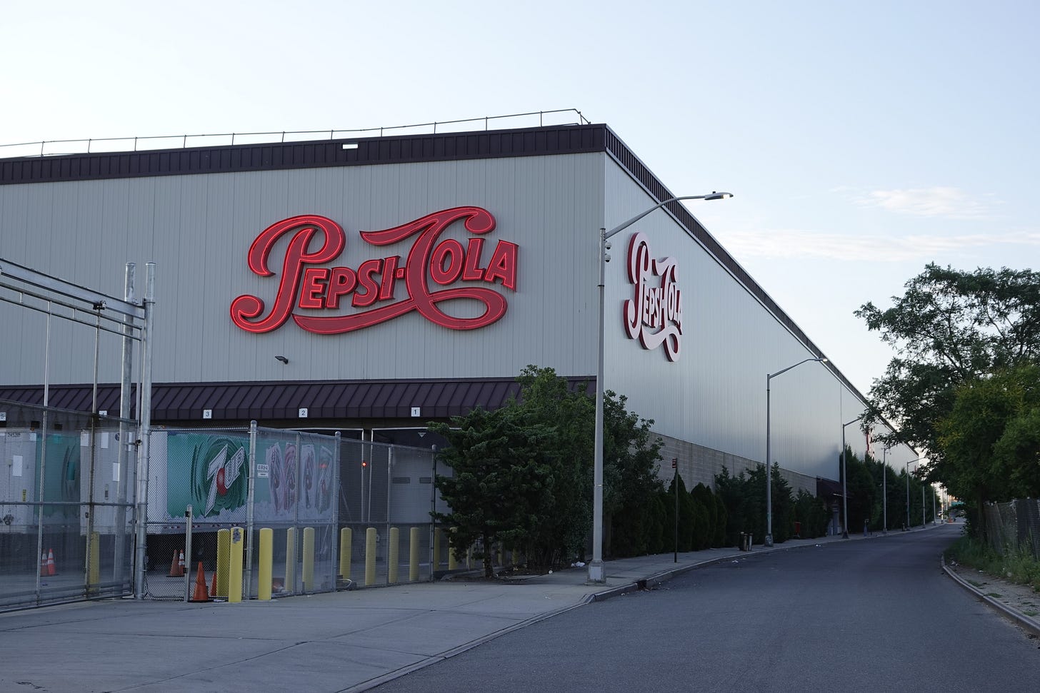
Pepsi-Cola sign, the Bronx
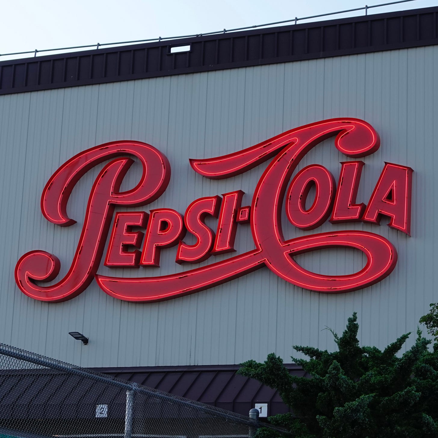
Interestingly, a longtime Pepsi bottling plant in the Bronx earlier this year installed a few signs, including one apparently lit with neon (!!!!), with what is a modified version of the cursive logo. The first indication I’ve seen of this simplified logo in newspaper archives is not 1940, as many logo sites report, but 1951, embedded in the Pepsi bottlecap logo. The equal sign was replaced with a hyphen, and some of the fanciful type flourishes were curtailed. It’s a good deal cleaner and crisper.
It was a wonderful surprise to see this logo on the Bronx facility, as this bottling plant has never had a Pepsi logo to my memory. [MAP]
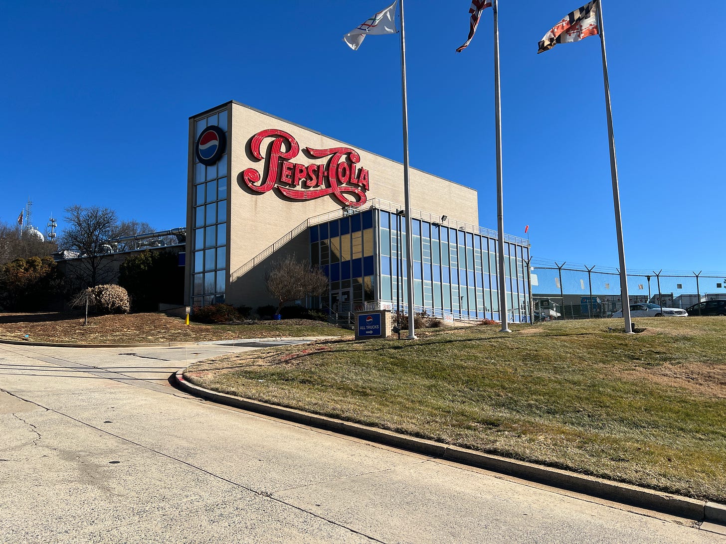
Pepsi-Cola sign, Hyattsville, Maryland
A cousin of this sign can be found at the Pepsi Bottling Group building in Hyattsville, Maryland. I’ve stopped at various times of day to capture it. [MAP]
THE BOTTLECAP (OR CROWN)
Keep reading with a 7-day free trial
Subscribe to The Retrologist by Rolando Pujol to keep reading this post and get 7 days of free access to the full post archives.


