The Retrologist field guide to Taco Bell's design evolution
Presented in honor of National Taco Day
Happy National Taco Day, fellow Retrologists! I’m marking the occasion by sharing photos of some Taco Bells I’ve visited over the years, each shedding light on a particular moment in the chain’s history.
1.) The very first Taco Bell
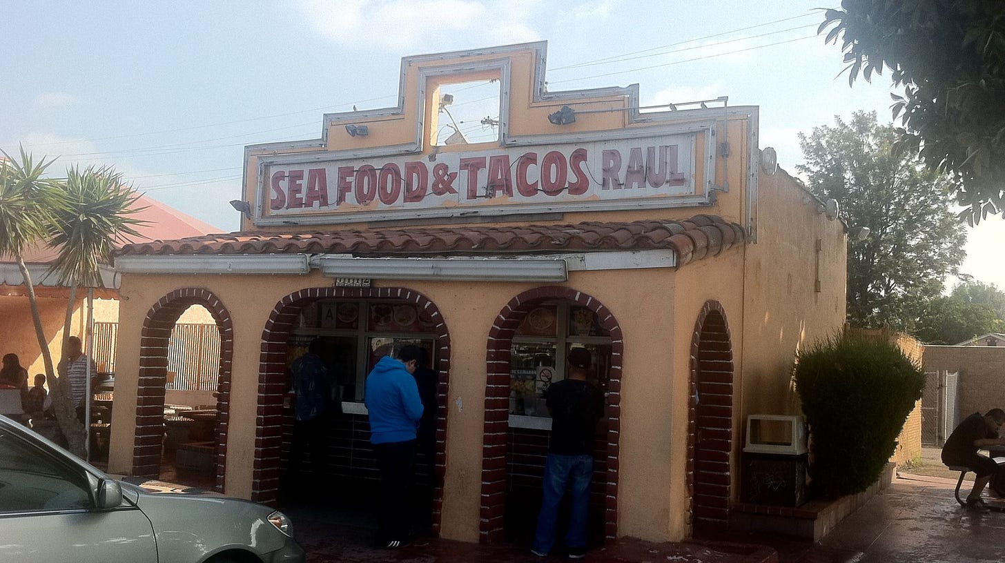
By the time I visited the first location of Taco Bell, in Downey, California, the chain had long ago left the building at 7112 Firestone Blvd., and Tacos Raul had stepped in. But the Bell bones were still evident in this photo from 2012. This building, which Glen Bell himself opened in 1962, was rescued from oblivion by Taco Bell itself and now sits on the corporate campus in Irvine.
They call it, of course, Numero Uno.
2.) The last ‘Sleeping Sombrero’ sign
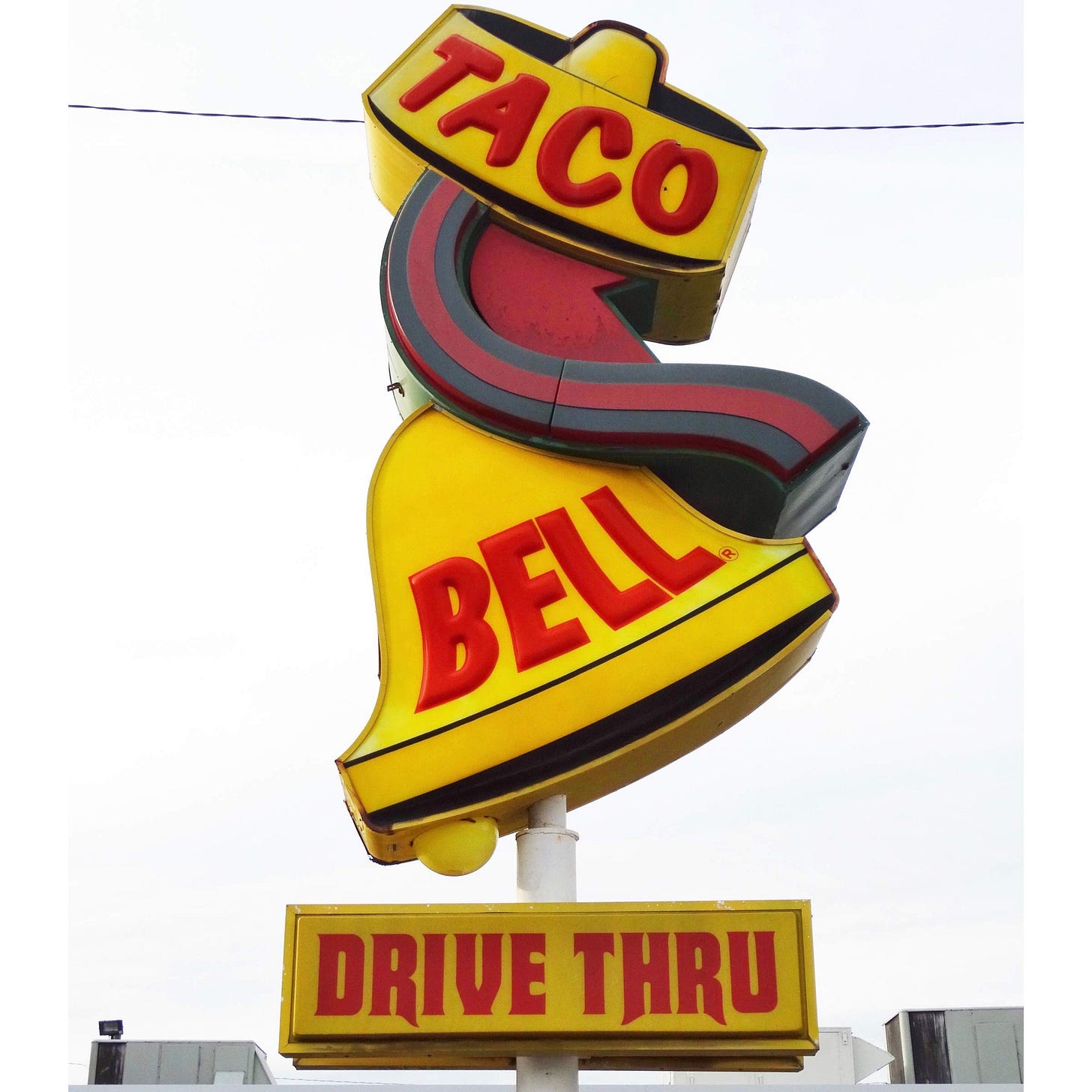
There are so many reasons to visit Savannah, Georgia. But no visit for me is complete without stopping at this Taco Bell, which is the last standing example of this sign of 1970s vintage.
It survives in the back of the building, almost forgotten, in what is an otherwise modern location. [MAP]
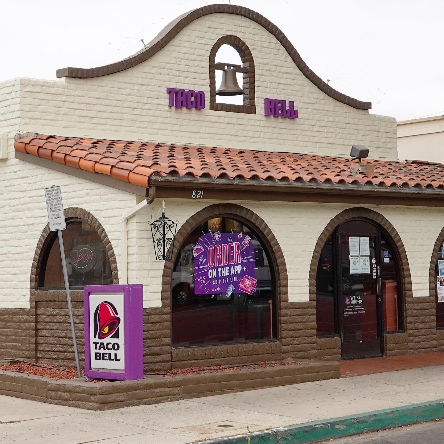
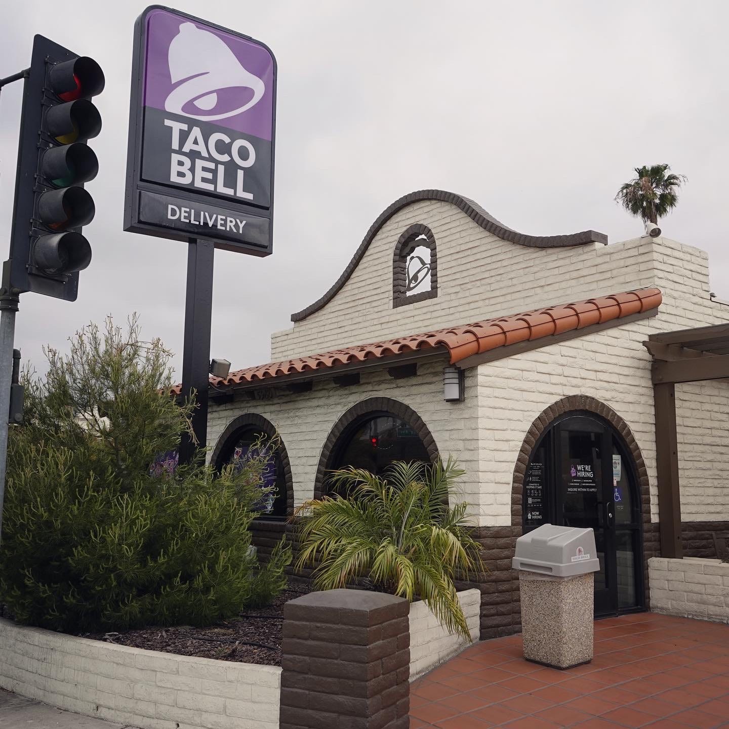
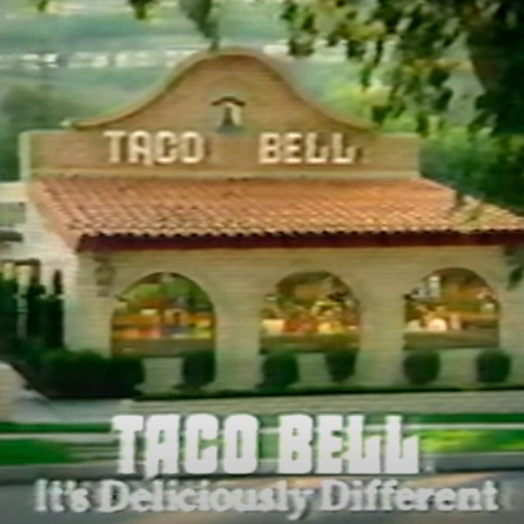
This sign would have fit with the two Taco Bells of the vintage show below. This first one, updated to the chain’s purple color scheme, survives in Santa Barbara, California. [MAP] The second is in adjacent Goleta, California. [MAP] The third image shows the design in a 1970s commercial.
3.) Taco Bell begins to modernize
This particular one was an interesting design, coming at a time when the chain sought to transition from a popular, regional Mexican food chain to a national fast-food restaurant that happened to serve Mexican food.
Working with S&O Consultants of San Francisco, the parent company Pepsico was repositioning Taco Bell so it would play better in parts of the country less familiar with or enamored by Mexican food.
As Philip Langdon details in “Orange Roofs, Golden Arches,” Taco Bell learned from a consumer study that the “sleeping sombrero” sign – which I showed you above — was not very popular, regardless of the social-media sensation it has become today. But the arched windows and tile roofs of the Mission-style buildings had more admirers.
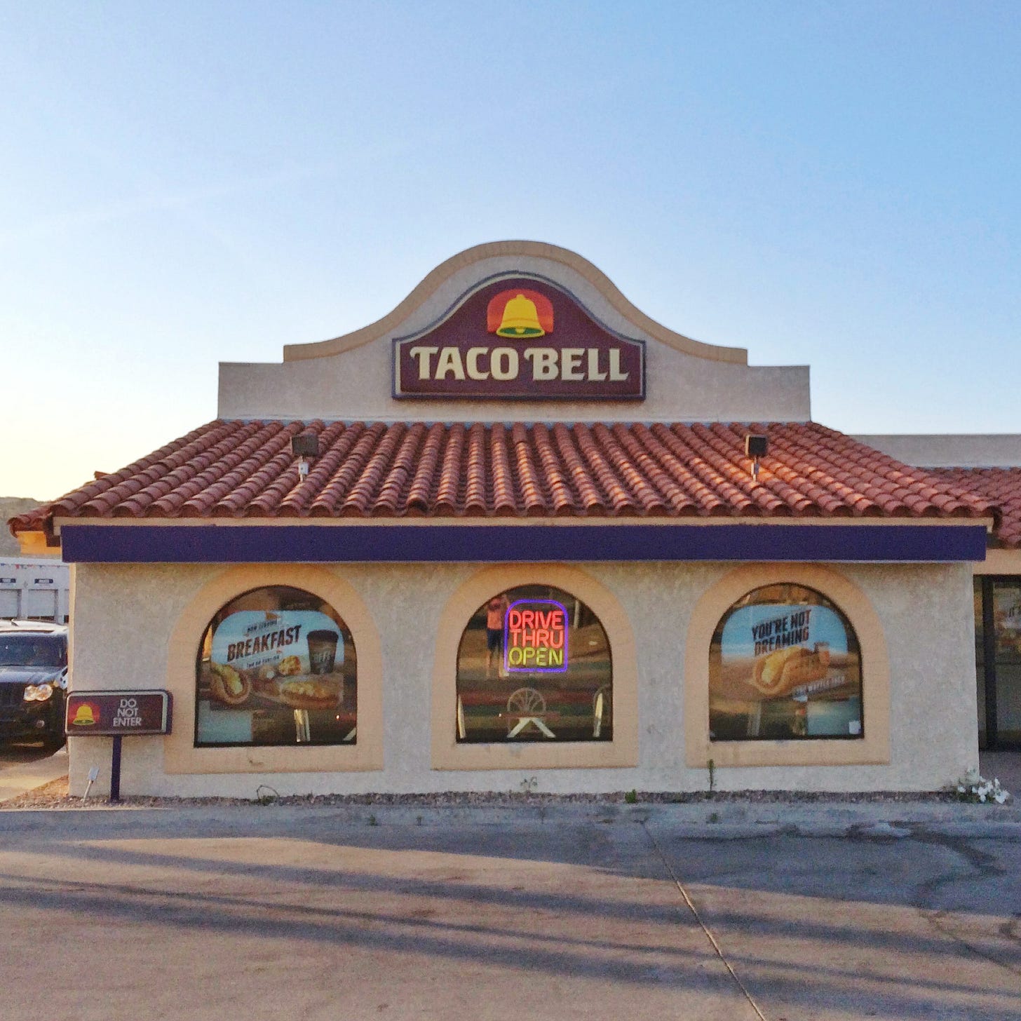
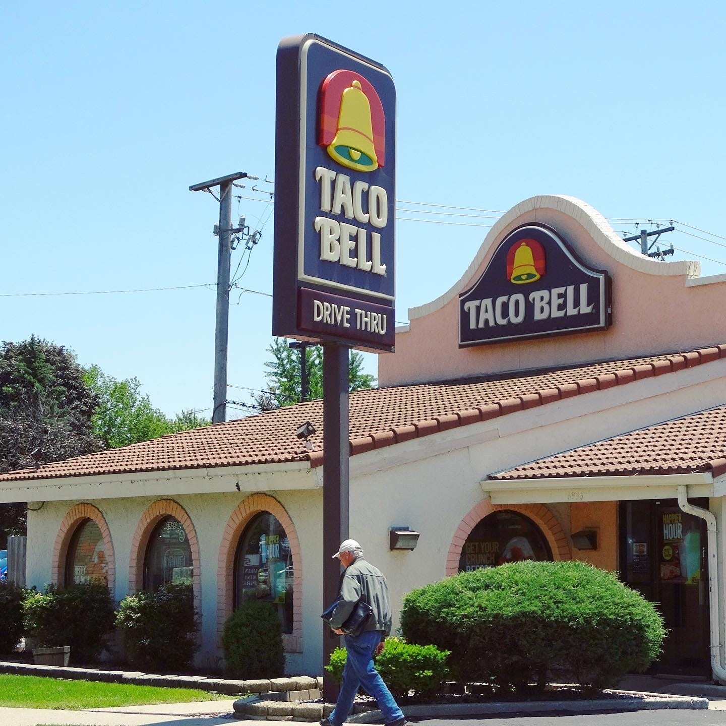
Taco Bell toned down its signage, featuring a colorful, simple bell. Stores would still get mission-style buildings, but they were more subdued, softened by a “Mainstream Mansard” roof and a plastic sign along the facade in place of the actual bell that was notched into earlier stores.
These examples were in Yucca Valley, California, above, and Berwyn, Illinois, below. Both are gone.
3.) The 1990s: Saved by the Taco Bell!
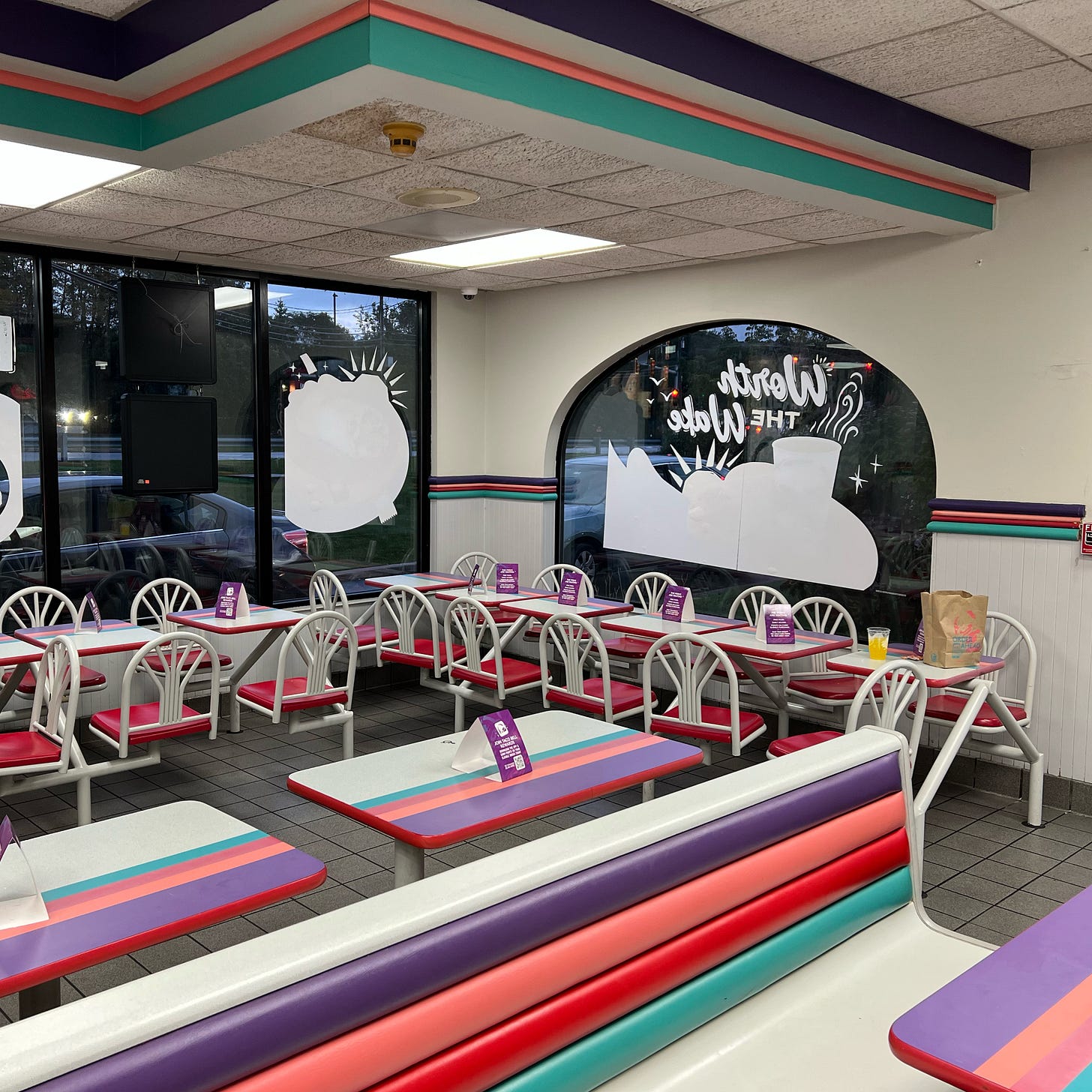
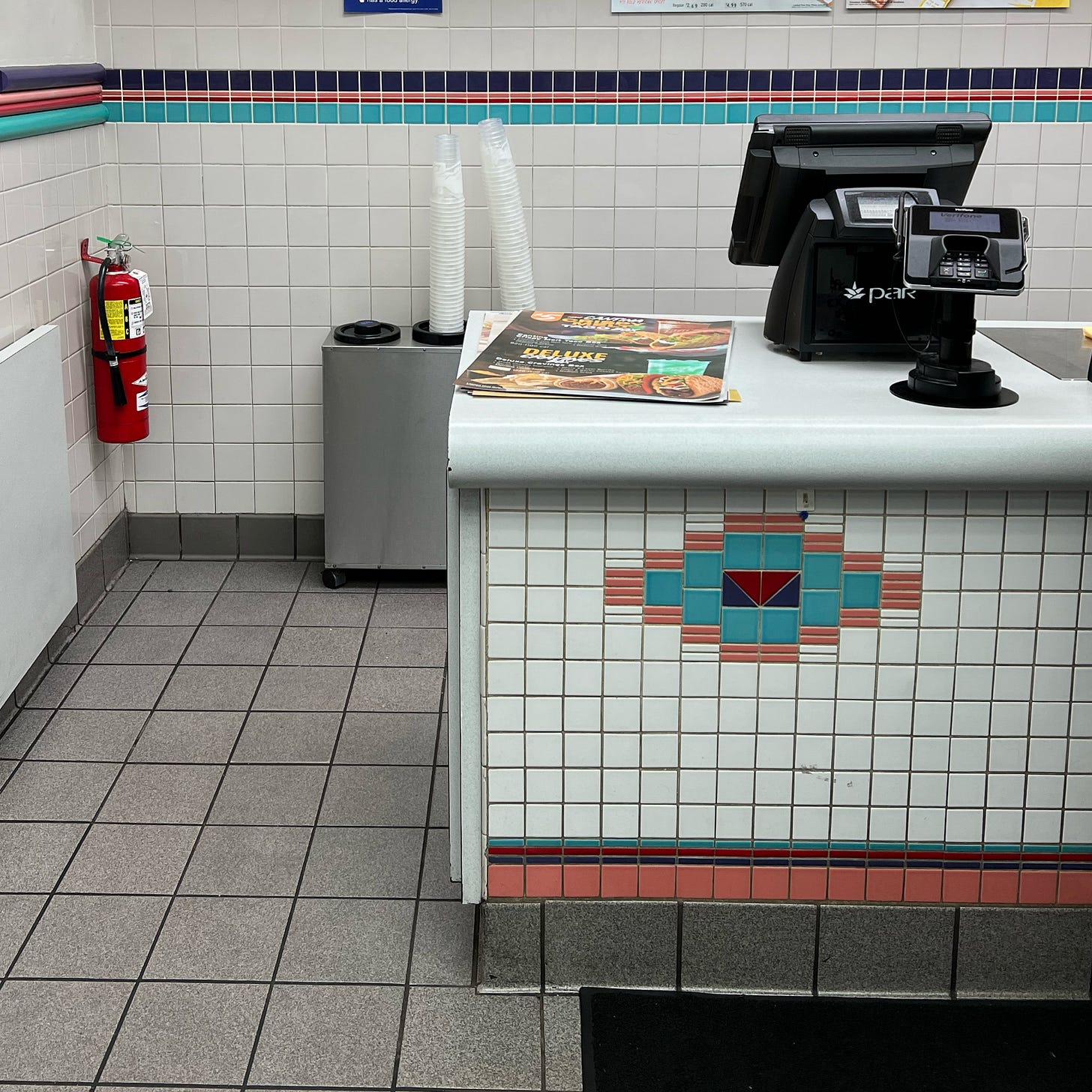
This Taco Bell in Pittsfield, Massachusetts, was a work of postmodern interior design, the Memphis movement for everyone. This is the opposite of the boring, safe retail architecture of today. I’ve seen a similar store (now demolished) described as a “Saved by the Taco Bell,” in the spirit of its decade of origin. Internally called Miami Vice, for the 1980s color scheme, this location, which I shot in 2021, is sadly no more.
4.) Forlorn, Forgotten and Fabulous in Texas …
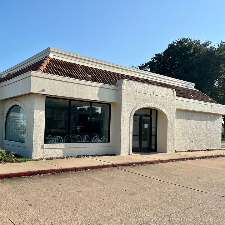
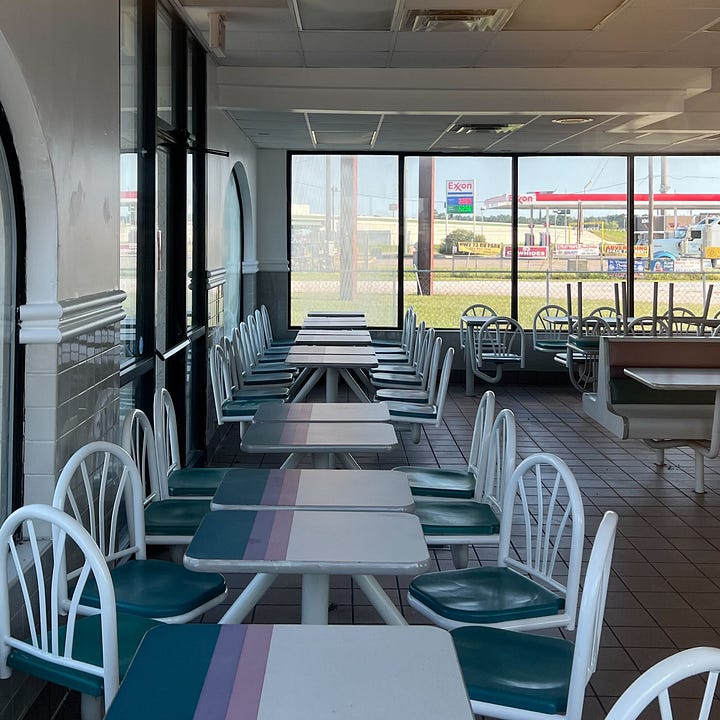
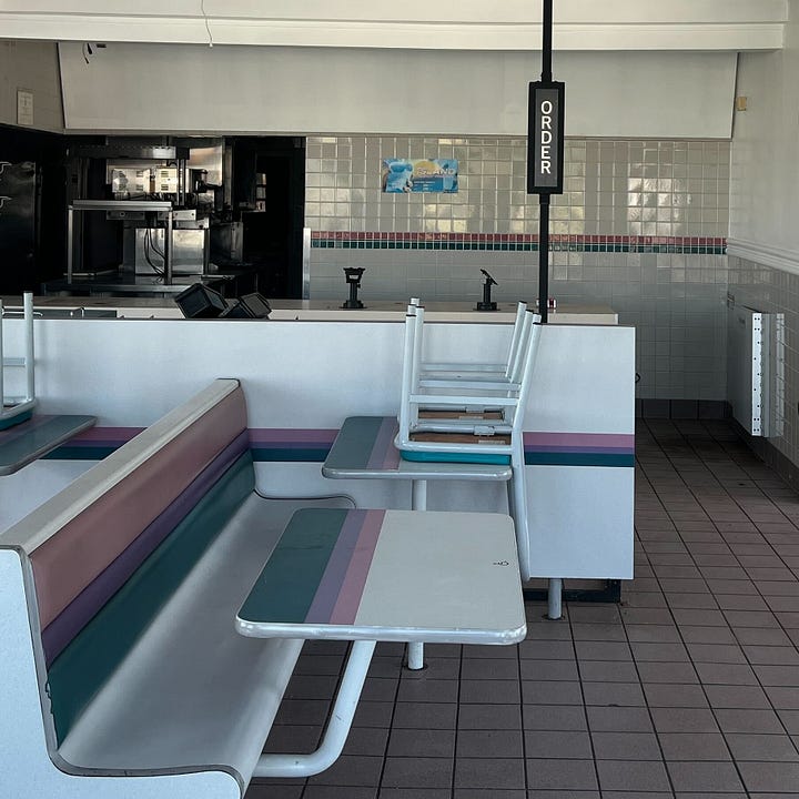
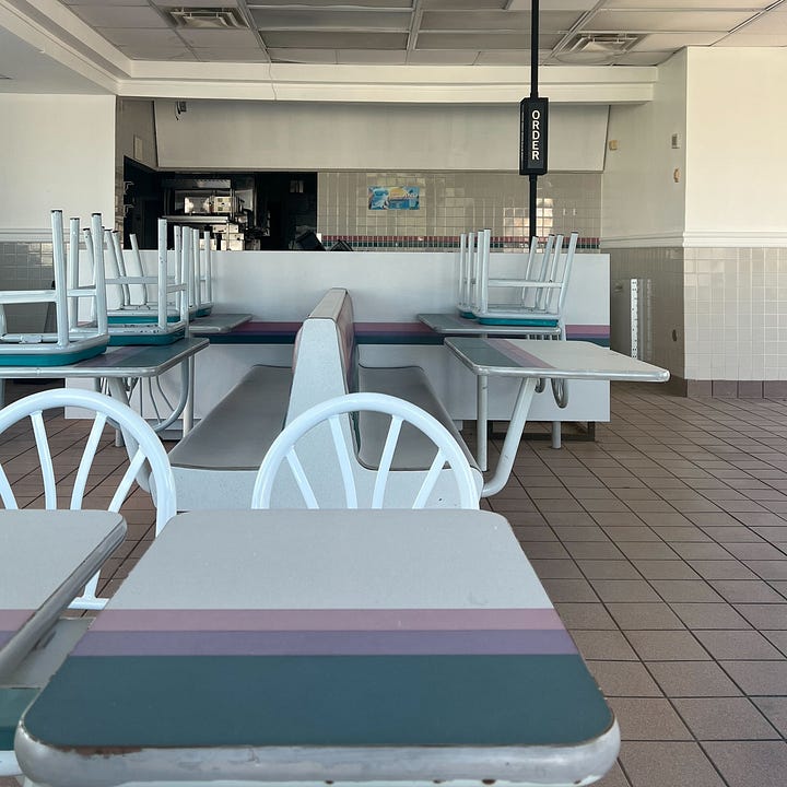
On a road trip this summer between Houston and Galveston, Texas, I spotted this beauty in the distance, shuttered. But from the look on the outside, I figured it might conceal a 1990s interiors — and it did. Revel in the photos I shot through the window here in Winnie, Texas. [MAP]



As a kid, I participated in a market research survey on the early 90s Taco Bell rebranding. I remember wondering why anyone would want pink and purple - I preferred the new logos with the old color scheme. When the rebranding came out with the pink and purple I couldn't believe people chose that one in the market research! Of course we don't know how many people really preferred it, but it always seemed weird to me!
I love this so much! I remember exactly what the Taco Bell looked like in Grand Rapids MI in the 90s. Now living in South Florida I feel like there are some hidden gems that are minimally modernized. Great article. Loved reading!